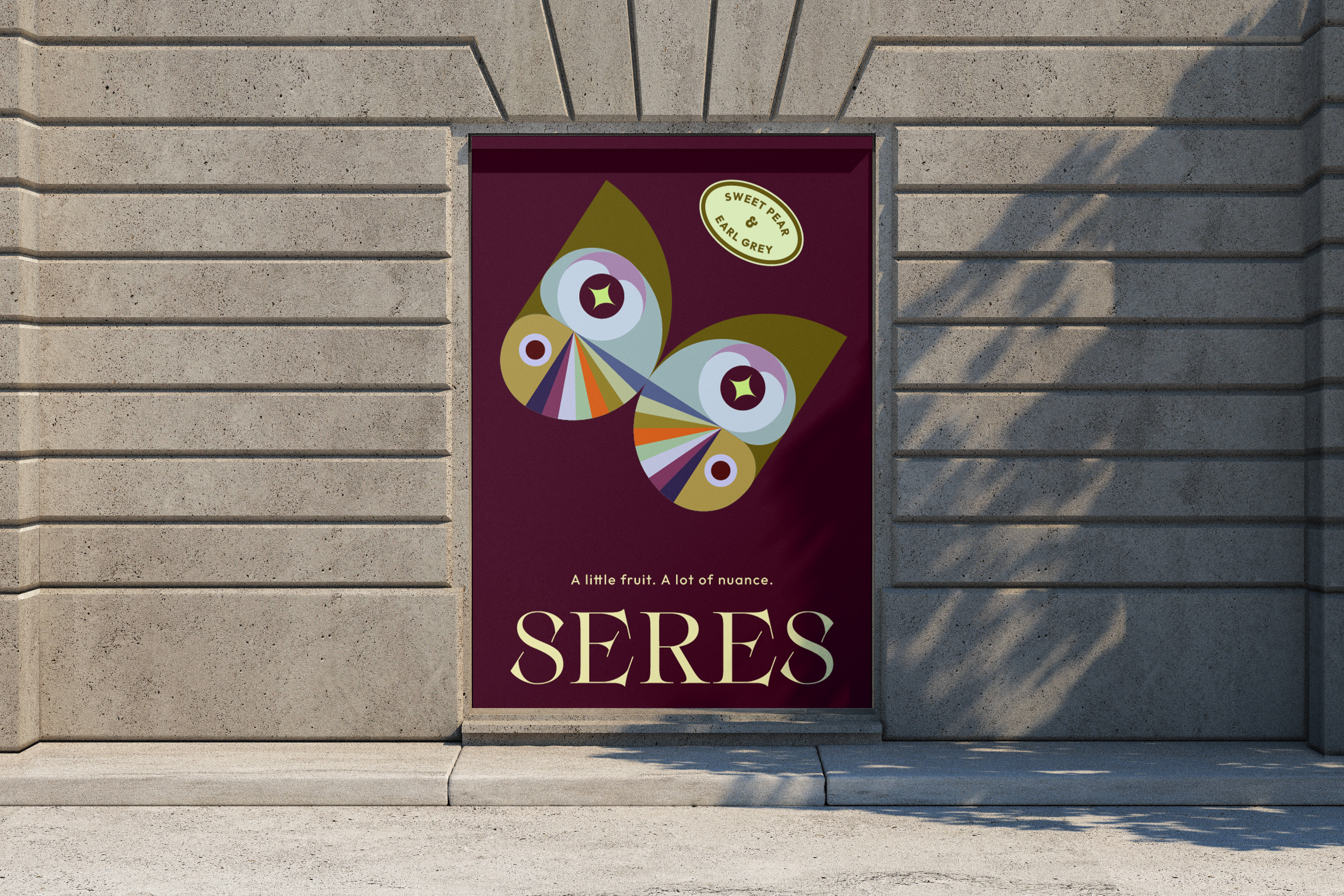
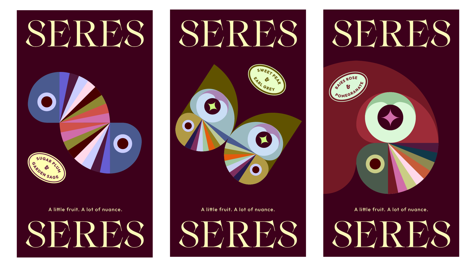
SERES, 2025
Personal Project, Toronto
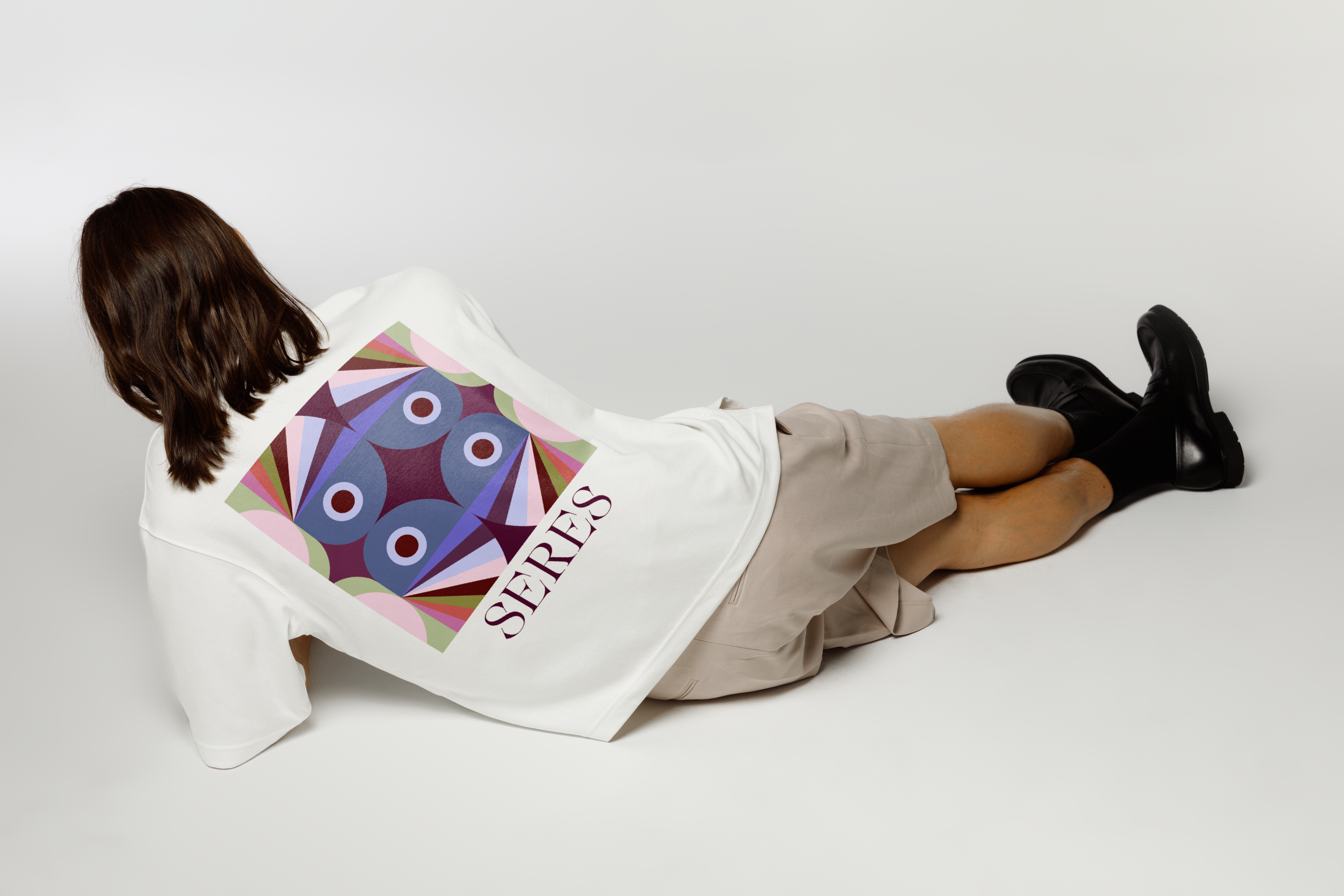
Graphic Identity / Stationary Design
PROJECT OVERVIEW
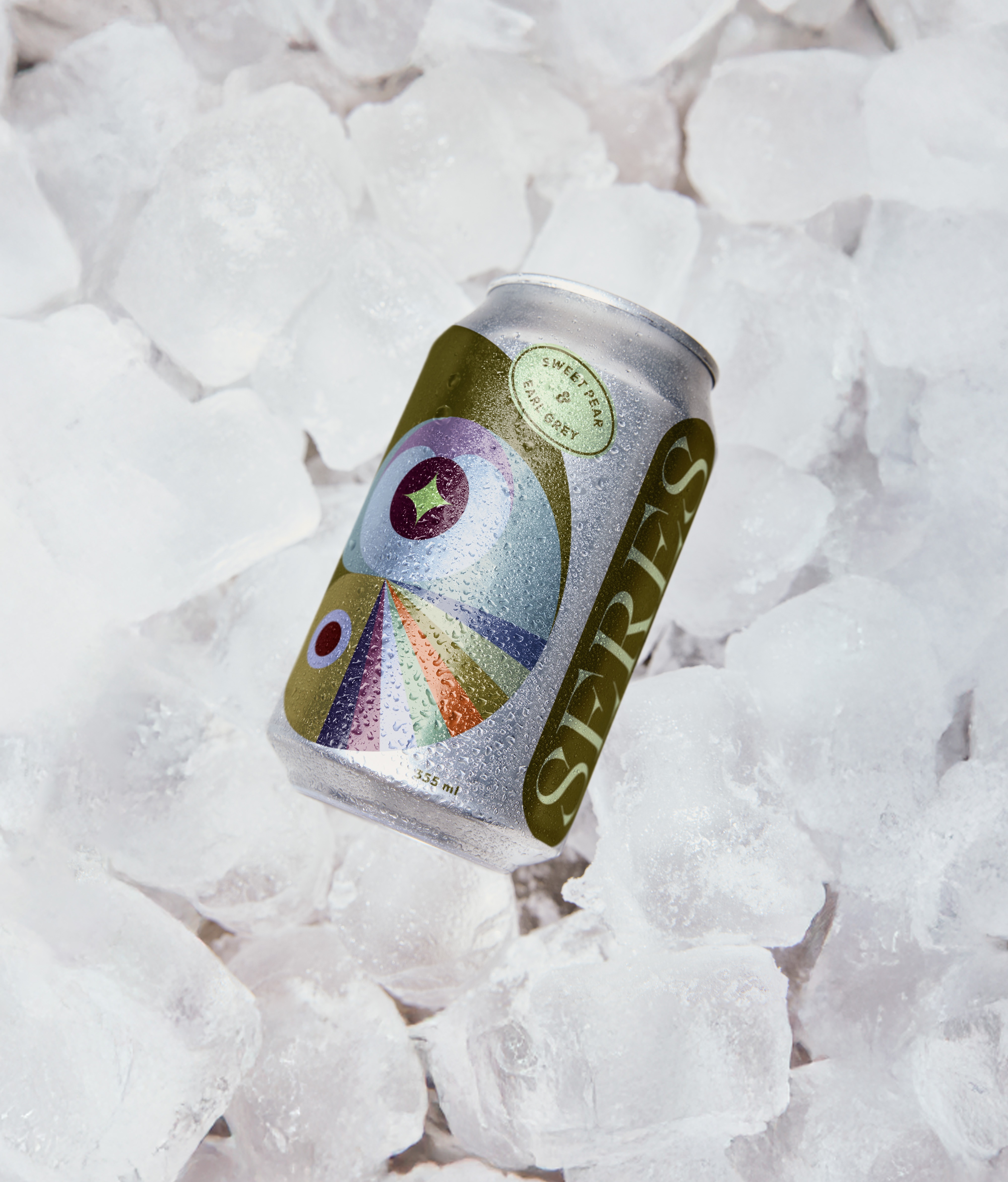
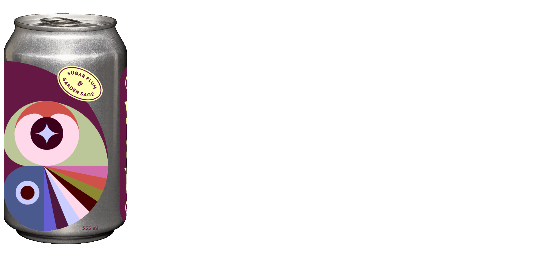
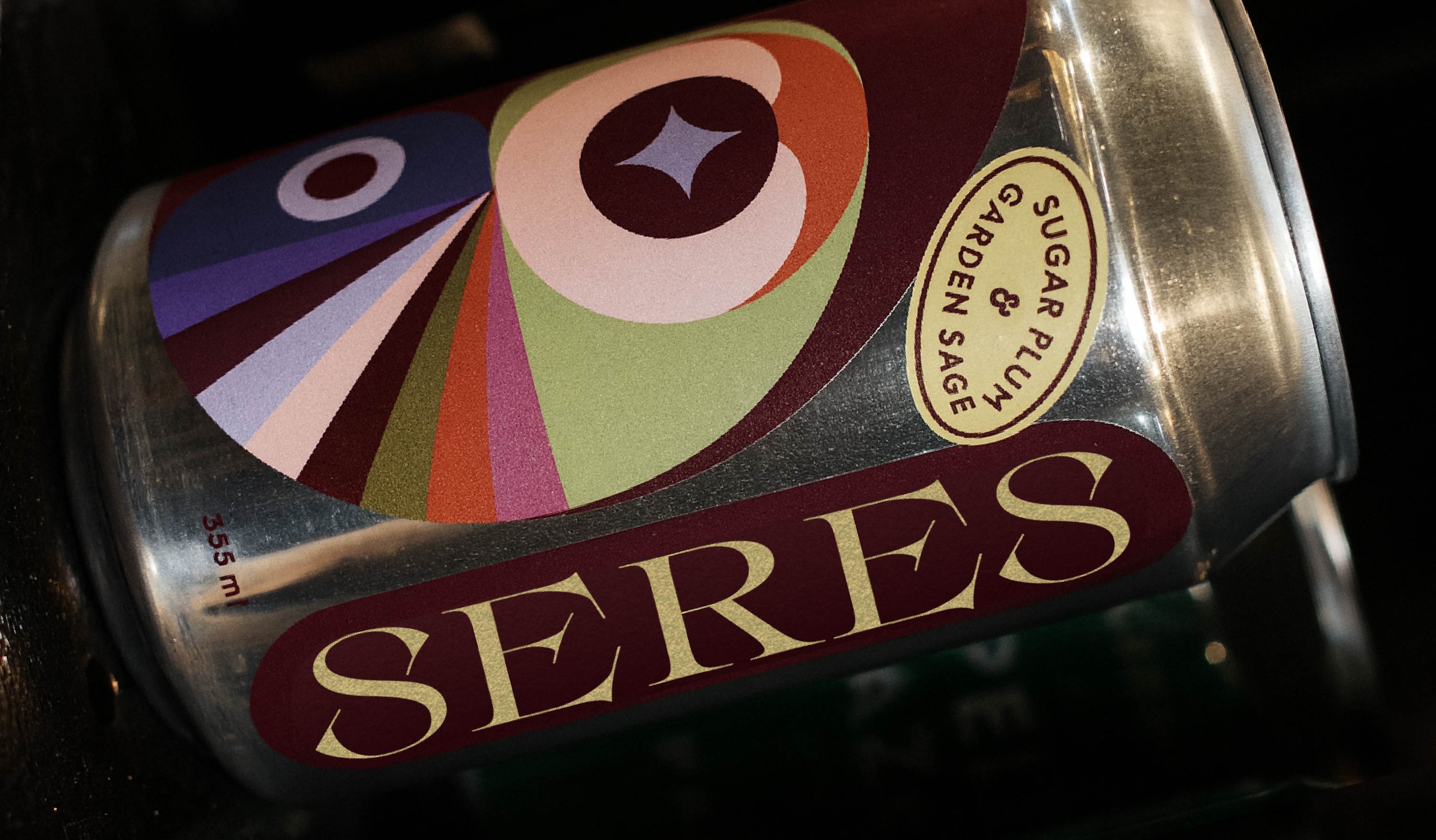
Seres is a sparkling water brand that treats flavor like fine tea: layered,
intentional, and rooted in botanical tradition. Built around the Fibonacci
spiral found throughout nature, the brand celebrates life's quiet complexity
through restrained fruit notes, herbal depth, and conceptual visual storytelling.
This branding project explores how abstract art, mathematical beauty,
and thoughtful flavor architecture can elevate everyday refreshment into something closer to ritual.
DESIGN INTENT
This project challenges the bright, cheerful aesthetic that dominates the sparkling water category.
Instead, Seres offers restraint, curiosity, and conceptual depth.
The Fibonacci spiral becomes a visual thesis: nature's patterns are everywhere, and paying attention makes life richer.
The layered sticker system and exposed aluminum create a sense of craft and transparency.
Every element, from the golden-ratio grid to the Top/Heart/Finish structure,
reinforces the brand's belief that thoughtful design elevates ordinary moments into something worth savoring.
BRAND POSITIONING
Promise - Naturally flavored sparkling water with tea-adjacent pairings, lightly sweetened with 10% real juice. Cultured refreshment that offers pleasure first, wellness second.
Audience - Design-minded drinkers, tea lovers, gallery and café regulars seeking something sophisticated without pretense. People who appreciate nuance over novelty.
Voice - Reserved, confident, curious. Quiet luxury with a touch of wit.
Differentiator - Flavor architecture borrowed from perfumery and tea: Top notes (fruit brightness from real juice), Heart (herbal or floral body), Finish (clean mineral close). Global botanical curation meets thoughtful restraint.
VISUAL IDENTITY
The Fibonacci Spiral
Seres means "beings" in Spanish, and the brand's visual language celebrates the mathematical patterns that connect all living things. The Fibonacci spiral, observed in seashells, flower petals, and galaxies, becomes the central motif. Each can features a bold, cropped spiral with radiating geometric wedges and a hypnotic central "eye."
The system evolves across touchpoints, morphing from spiral into animals (caterpillar, butterfly, macaw) to reinforce the connection between mathematics, nature, and transformation.
Design Inspiration
The visual direction draws heavily from Hilma af Klint, the first abstract artist, whose work explored spirituality, geometry, and the unseen structures of nature. Her language of structured forms, muted palettes, and symbolic layering informs every design decision.
Design System
The designs are applied as separate stickers layered directly onto bare aluminum cans, creating depth and revealing glimpses of raw material beneath. This approach adds tactile interest and visual intrigue while standing apart from competitors' printed sleeves.
Each can features an oval label styled after fruit stickers at the grocery store, grounding the conceptual design in familiar, everyday ritual.
Typography pairs an elegant serif for the SERES logotype with a modern grotesk for descriptors. All placements follow a golden-ratio grid, reinforcing the Fibonacci theme structurally.
PACKAGING ARCHITECTURE
Front Panel
The vertical SERES logotype anchors the right side of the can, parallel to the spiral illustration as the hero element. Between the two elements the flavor name is presented in a small oval fruit-sticker style.
Back Panel
Tasting notes structured as Top / Heart / Finish guide the experience. Ingredient statement, calorie and sugar count per can, serving suggestion (serve cold), and recycling mark complete the panel.